Peek Through Background Effect
I recently came across the CodeKit 2.0 landing page and really like the animations used throughout. Some animations were so subtle that I didn’t realize them until looking through a few times.
One that I really like that I wanted to try to replicate was in the Source Maps and Minifiers Section:
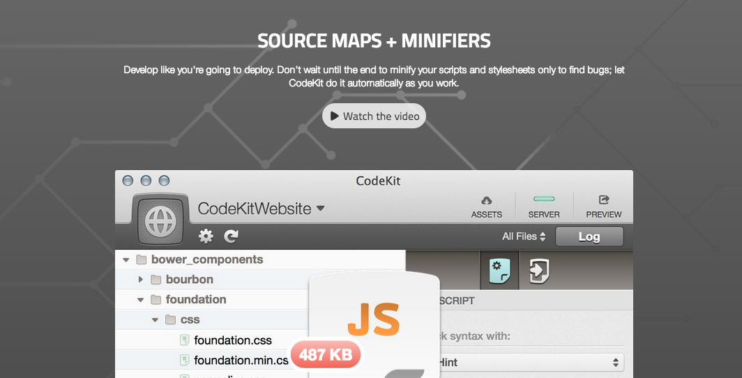
The subtle animation with the background pattern has a cool effect that makes the pattern look like its being filled up. I had to try to recreate this myself but I wanted to put my own spin on it.
Top Layer
Instead of the circuit board looking graphic, I used this hexagon nextwork graphic that is repeatable. The trick here is to use a positive foreground and whatever cuts you want to show through should be transparent. Also, you’ll have more flexibility and sharper results if you use SVG (especially if you only support IE9+). This will be used as a CSS background image.

.container {
  background-image: url('http://timteeling.com/dev/img/network.svg');
}
Bottom Layer
I’m going to get to the middle layer in a moment, but our base layer will be a background color. The color set here will be what shows through the clipped image. I set it to #263645.
.container {
  background-color: #263645;
  background-image: url('http://timteeling.com/dev/img/network.svg');
}
Fancy Middle Layer
Now the fun part. I want parts of the hexagons to light up orange like they are parts of a network being scanned. We can have multiple background images by separating them with commas and in this case we are going to add a gradient to go with the image we already have.
Here is what we see below the image.
.container {
  background-color: #263645;
  background-image: url('http://timteeling.com/dev/img/network.svg'),
  radial-gradient(200px 500px at center, #ff8300 0%, transparent 50%, transparent);
  background-size: 125%, 50% 100%;
  background-position: 0 60%, 0 100%;
}
Adding Animation
Now we want the orange gradient to move across the screen, we can do this by animating our background-position. Note that we need to account for both background images. We only want to animate the second image so our background-positions need to be comma separated.
@keyframes move {
    0% {
        background-position: 0 60%, 0 50%;
    }
    100% {
        background-position: 0 60%, 100% 50%;
    }
}

.container {
  background-color: #263645;
  background-image: url('http://timteeling.com/dev/img/network.svg'),
  radial-gradient(200px 500px at center, #ff8300 0%, transparent 50%, transparent);
  background-size: 125%, 50% 100%;
  background-position: 0 60%, 0 100%;
  animation: move 5s linear infinite;
}
Final Effect
Now that we have all three layers on top of one another, we can animate the middle layer to get the spotlight or moving fill effect. The final effect can be seen on CodePen.
See the Pen Peeking Through the Background by Tim Teeling (@timteeling) on CodePen.